

How to use the Dashboard:
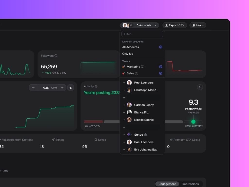
- Select LinkedIn Accounts to compare: Click the dropdown at the top-right to filter analytics per account, select All Accounts to view combined performance, or select Teams to analyze performance for specific groups within your workspace.
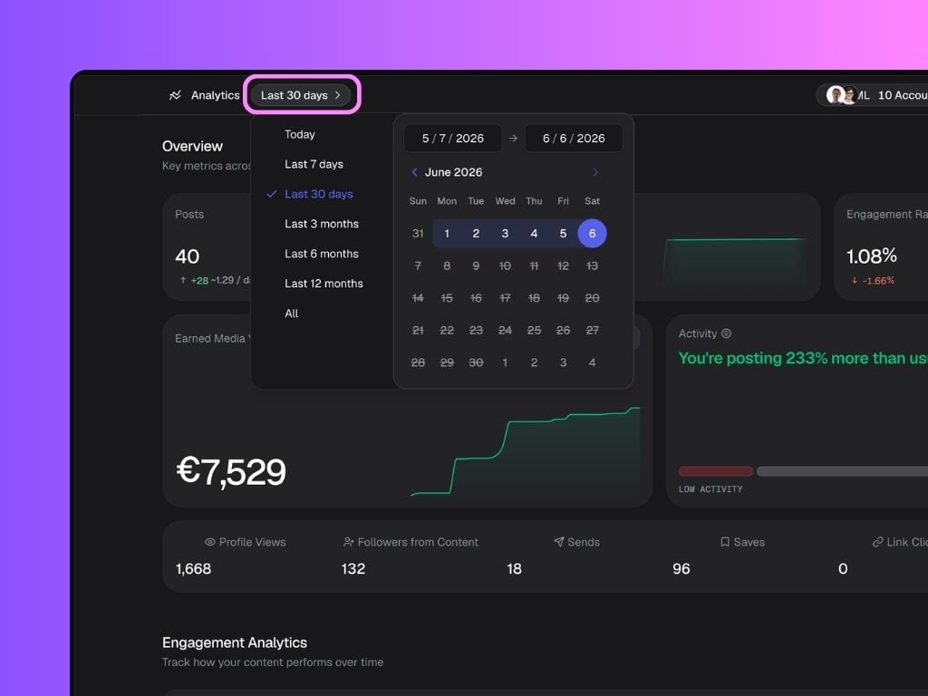
- Select a date range: Switch between 7 days, 30 days, 3 months, 6 months, 1 year, or custom ranges to analyze performance over time.
In the Business Plan, you’re able to click Export CSV (top-right corner) to generate a shareable performance report. The report is downloaded as a .CSV file, containing most metrics displayed in your dashboard — including posts, impressions, likes, and comments. You can open it in tools like Excel, Google Sheets, or Notion databases for deeper analysis or reporting.
Metrics Overview
At the top of the page, you’ll find your main performance metrics for the selected time range:- Posts: Number of posts published.
- Followers: Growth in LinkedIn followers.
- Engagement Rate: % based on likes, comments, shares per impression.
- Earned Media Value: The estimated value of your impressions based on your average CPM (Cost per thousand impressions).
Click the currency symbol in the top-right corner of the EMV box to switch between €, $, and £.
- Activity Tracker: See how your team’s posting frequency compares to previous periods.
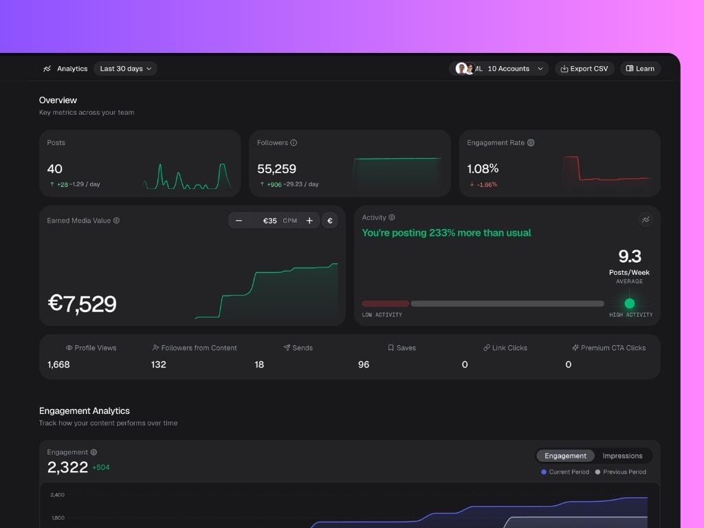
- Profile Views: Visits to your profile.
- Followers from Content: New followers gained from posts.
- Sends: Times your content was shared.
- Saves: Times your content was saved.
- Link Clicks: Clicks on links in your posts.
- Premium CTA Clicks: Clicks on your LinkedIn Premium Call-to-Action button (such as Visit Website, Book an Appointment, or Learn More) that directs visitors to an external destination.
Engagement Analytics
The top chart shows your total Engagement or Impressions for the selected period. You can switch between both metrics using the toggle in the top-right corner of the chart. Scripe also compares your current period against the previous one, making it easy to spot trends and measure growth. The second chart visualizes the relationship between your posting activity and follower growth. The bars represent the number of posts published, while the line shows how many followers were gained during the same period. This can help you identify whether increased posting frequency is contributing to audience growth.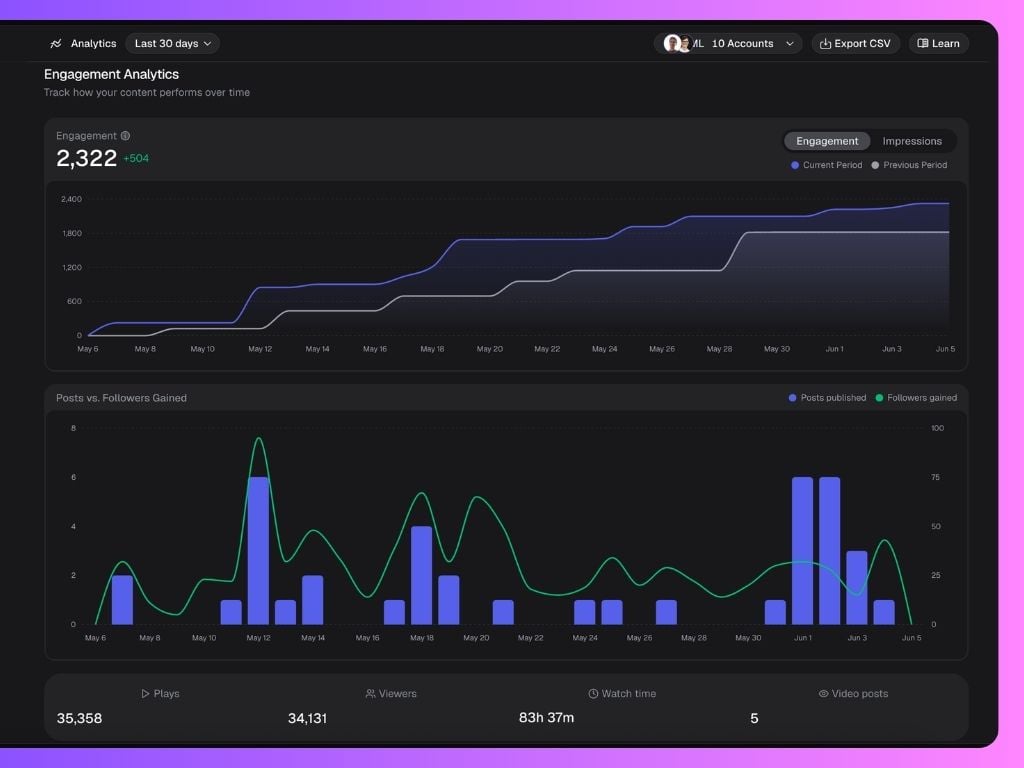
- Plays — Total video views across all video content.
- Viewers — Unique people who watched your videos.
- Watch Time — Total time spent watching your videos.
- Video Posts — Number of videos published during the selected period.
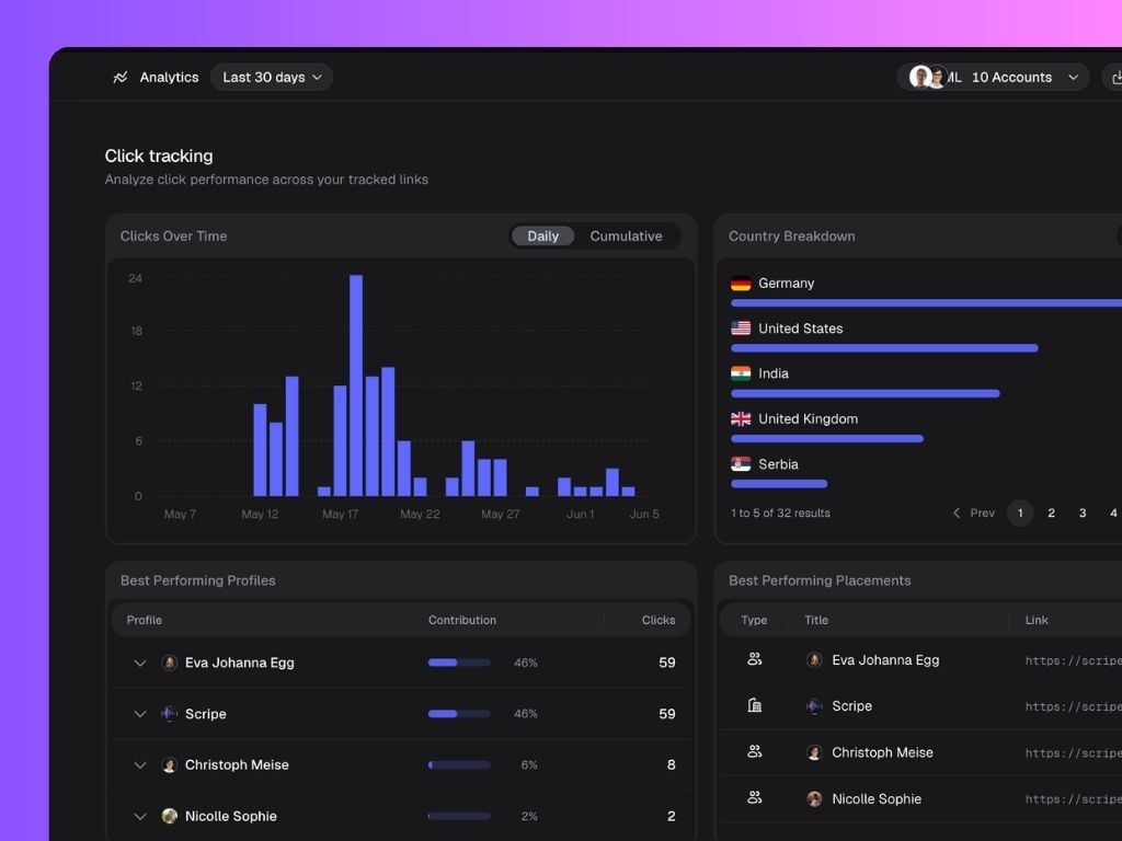
Click Tracking Analytics
Scripe automatically tracks clicks generated through your tracked links so you can better understand what is driving engagement.This feature is only available on the Business Plan.
- Clicks Over Time
- Country Breakdown
- Best Performing Profiles
- Best Performing Placements (Company, Profile, Posts, or Other)
Company Pages Analytics
The sections below provide aggregated analytics for all Company Pages connected and managed through Scripe. This includes:- Device Demographic: shows whether visitors are viewing your company page from desktop or mobile devices.
- Page Sections: shows which parts of your company page receive the most traffic.
- Follower Demographics: explore audience insights across your Company Pages, including: country, industry, seniority, job function, and company size
- Engagement Breakdown: clicks, impressions, likes, comments, engagement rate, total page views and unique visitors.
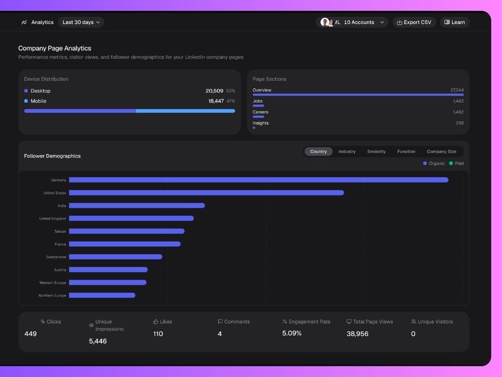
By default, these analytics combine data from all connected Company Pages. To view analytics for a single Company Page, use the filter at the top of the dashboard to select the specific page you want to analyze. After applying the filter, scroll down to this section to view the Company Page-specific analytics.
Yearly Activity Visualization
The 3D Activity Chart visualizes your team’s LinkedIn posting behavior over the year.Each bar represents post activity, color-coded by content pillar:
- 🟣 Personal
- 🟠 Promotional
- 🟢 Organizational
- 🔵 Educational
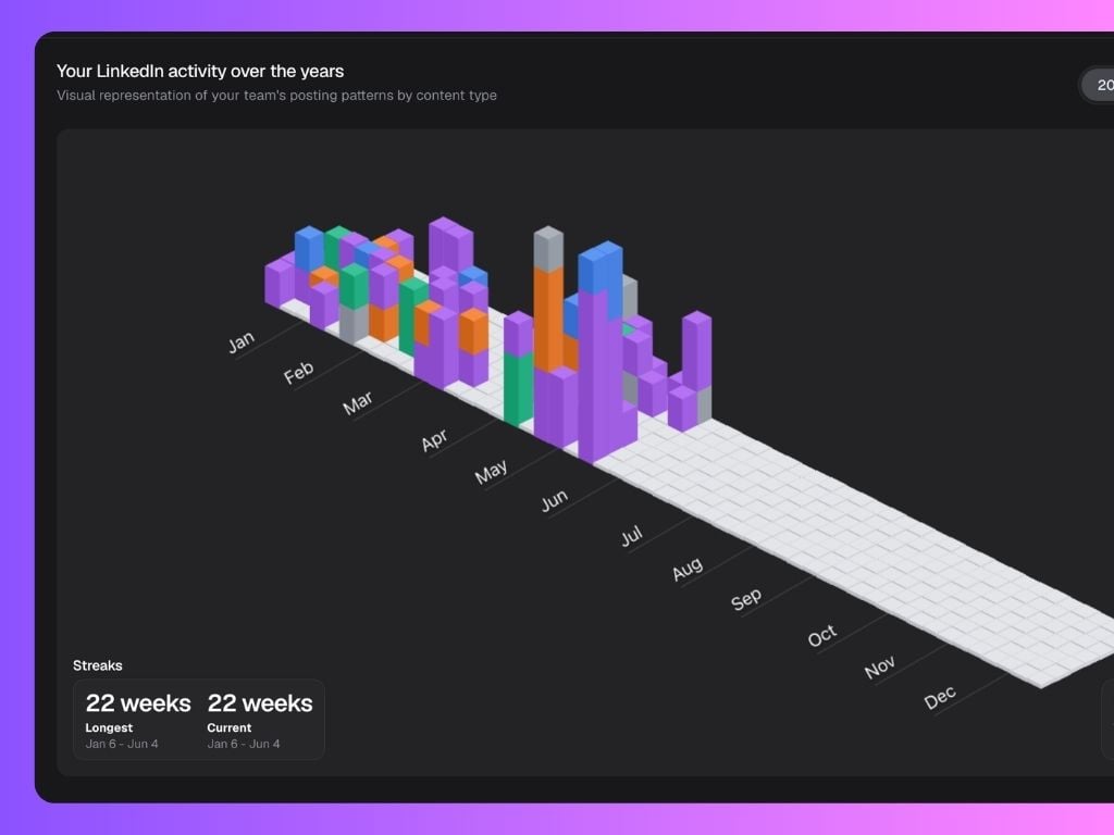
 At the bottom, you’ll also find:
- Streaks: Longest and current posting streaks.
- Post History: Total posts and your best-performing day.
Performance Analysis
The Performance Analysis section breaks down your team’s content performance in detail — and can be filtered by Posts, Impressions, Likes, or Comments depending on what you want to measure. You can toggle between these filters at the top-right of the section to see how each metric affects your team’s performance view. It includes:- Content Type Performance: Average results per content category (e.g. Personal, Promotional, Educational, Organizational). This helps you see which type of content your team’s audience engages with most.
- Top Post Formats: The best-performing post formats. Switching filters here lets you analyze what drives the most likes versus impressions, for example.
- Media Type Performance: How different media formats perform (text-only vs image posts).
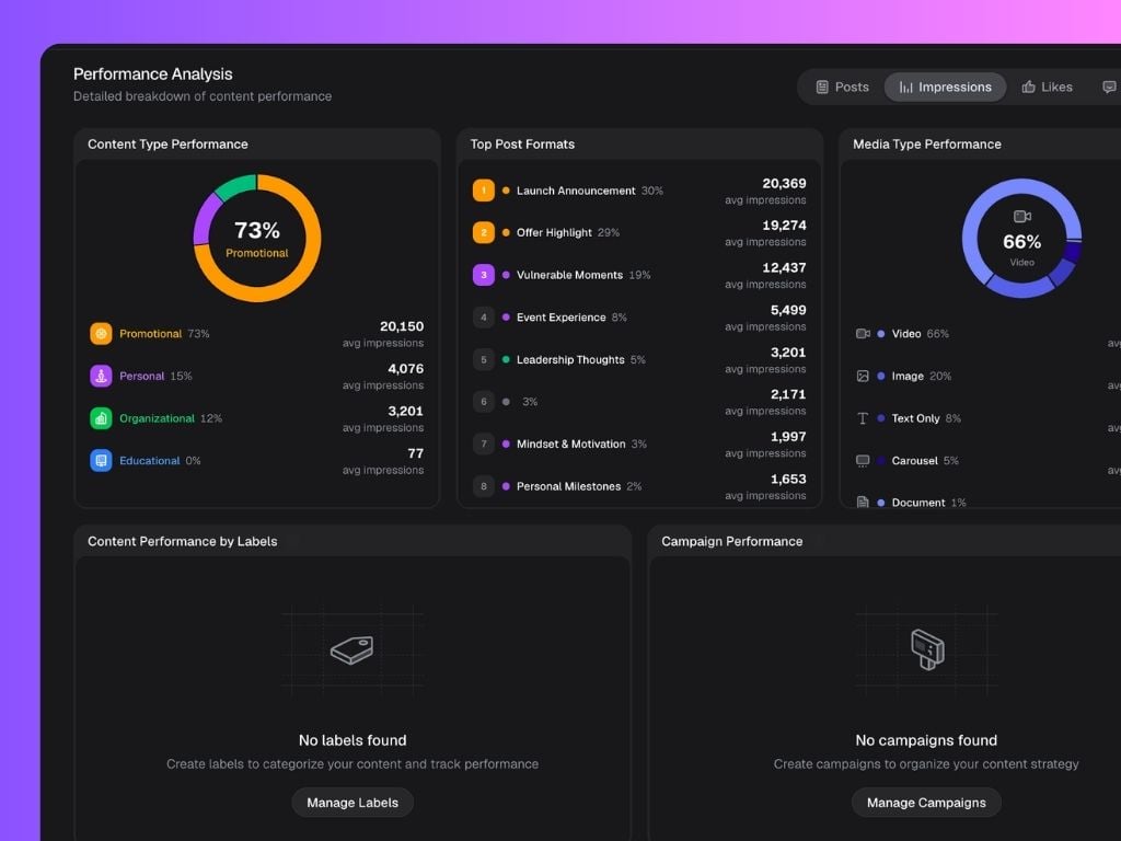

- Content Performance by Labels: Compare performance for your pre-set content labels.
- Content Performance by Campaigns: See the overall results of your Campaigns for the selected period of time.
Campaigns are shown if they have posts created during the selected date range. Performance metrics reflect all engagement data for those posts and not only for the selected date range.
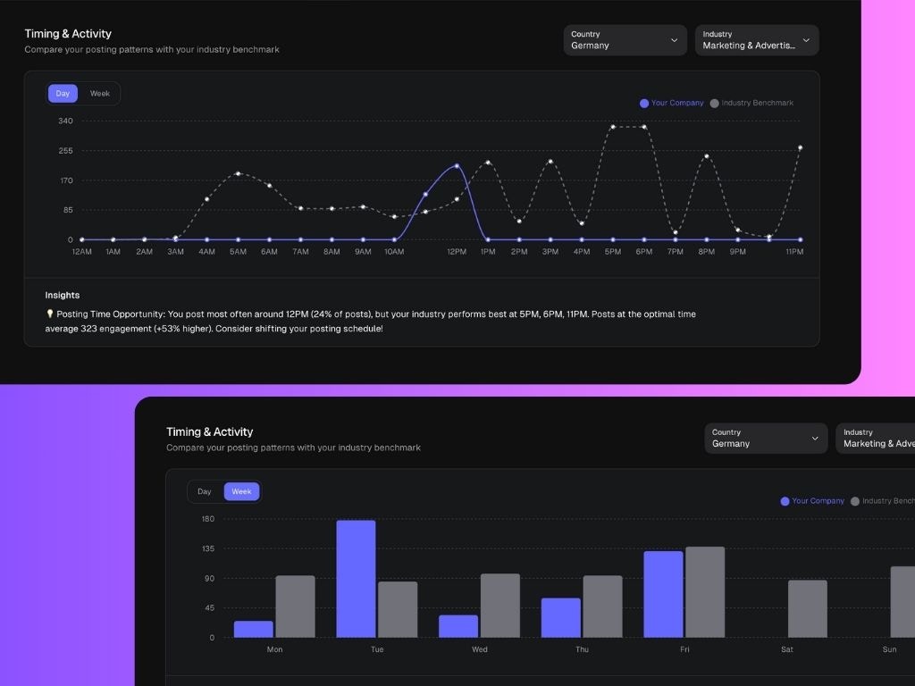
Timing & Activity
This chart compares your company’s posting behavior with industry benchmarks to help identify the best times to post daily and weekly.- Blue line: Your company’s posting times.
- Gray dotted line: Average posting time for your industry.
- Insights: Automatically generated tips on when to post for higher engagement.
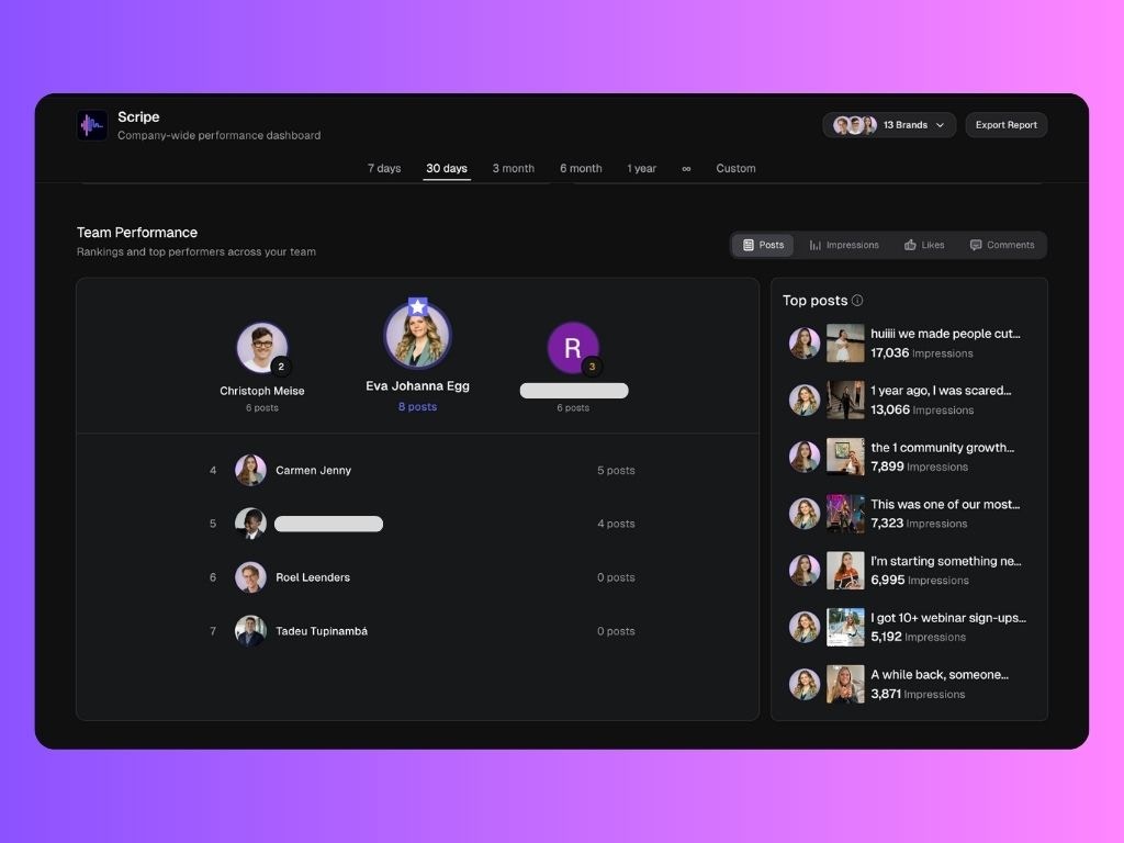
Team Performance
The Team Performance section ranks your top creators and shows who’s driving the most engagement. You’ll see:- Leaderboard: Sorted by total posts within the selected period.
- Top Posts: Highlights your team’s most-viewed posts with impressions count.
Content Library
The Content Library lists every post published by the Personal Brands managed in Scripe with complete performance metrics. You can view:- Post title and content type
- Labels and campaigns assigned
- Detailed metrics for each post: impressions, likes, comments, engagement rate, and post date