Scripe’s Analytics dashboard gives you a clear picture of how your LinkedIn content is performing, helping you refine your strategy and double down on what works.Documentation Index
Fetch the complete documentation index at: https://docs.scripe.io/llms.txt
Use this file to discover all available pages before exploring further.
Metrics Overview
At the top of the page, you’ll find your main performance metrics for the selected time range:- Posts: Number of posts published.
- Followers: Growth in LinkedIn followers.
- Engagement Rate: % based on likes, comments, shares per impression.
- Earned Media Value: The estimated value of your impressions based on your average CPM (Cost per thousand impressions).
Click the currency symbol in the top-right corner of the EMV box to switch between € and $.
- Activity Tracker: See how your current posting frequency compares to previous periods.
- Impressions: Total reach for the selected period of time.
- Engagement Count: Total interactions (likes, comments, shares).
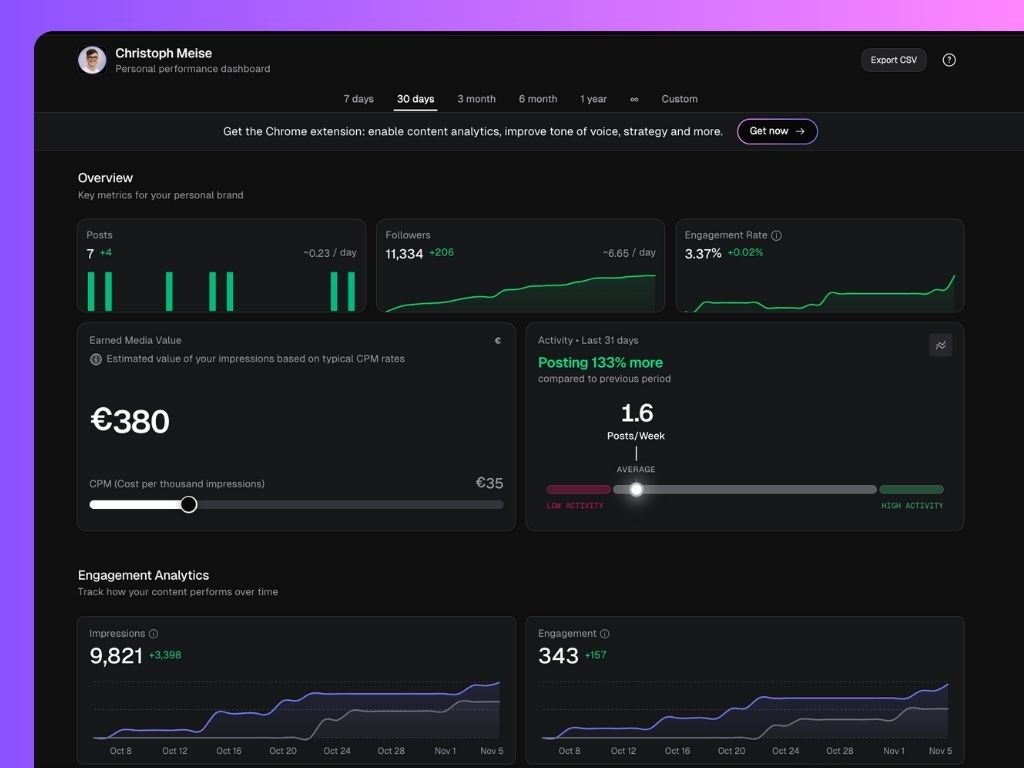
At any time, click Export Report (top-right corner) to generate a shareable performance report. The report is downloaded as a .CSV file, containing most metrics displayed in your dashboard — including posts, impressions, likes, and comments. You can open it in tools like Excel, Google Sheets, or Notion databases for deeper analysis or reporting.
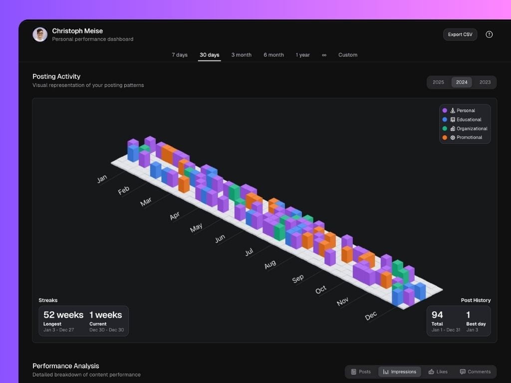
Yearly Activity Visualization
The 3D Activity Chart visualizes your team’s LinkedIn posting behavior over the year.Each bar represents post activity, color-coded by content type:
- 🟣 Personal
- 🟠 Promotional
- 🟢 Organizational
- 🔵 Educational
- Streaks: Longest and current posting streaks.
- Post History: Total posts and your best-performing day.
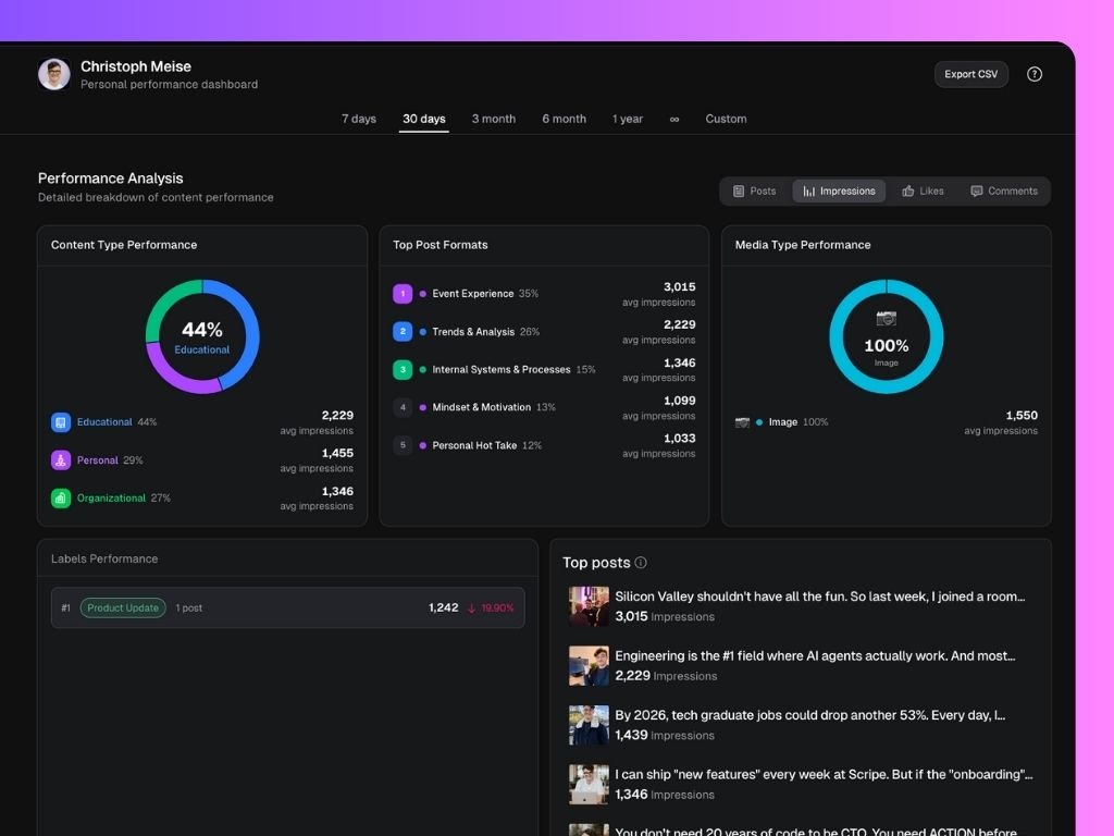
Performance Analysis
The Performance Analysis section breaks down your team’s content performance in detail — and can be filtered by Posts, Impressions, Likes, or Comments depending on what you want to measure. You can toggle between these filters at the top-right of the section to see how each metric affects your team’s performance view. It includes:- Content Type Performance: Average results per content category (e.g. Personal, Promotional, Educational, Organizational). This helps you see which type of content your audience engages with most.
- Top Post Formats: The best-performing post formats. Switching filters here lets you analyze what drives the most likes versus impressions, for example.
- Media Type Performance: How different media formats perform (text-only vs image posts).
- Content Performance by Labels: Compare performance for your pre-set content labels.
- Top Posts: See the overall ranking of your top posts for the selected period of time, and metric.
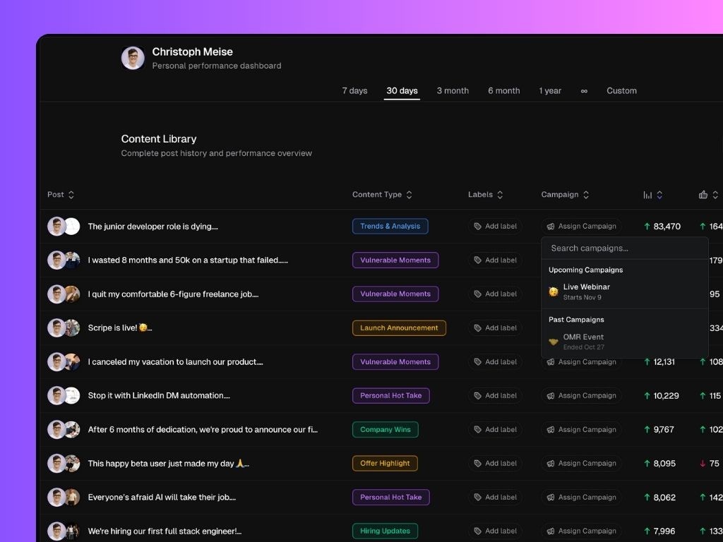
Content Library
The Content Library lists every post published, with complete performance metrics. Here you can view:- Post title and content type
- Labels and campaigns assigned
- Detailed metrics for each post: impressions, likes, comments, engagement rate, and post date